Open & Eat · 2024
Canned chicken breast, with a label that says exactly what is inside.
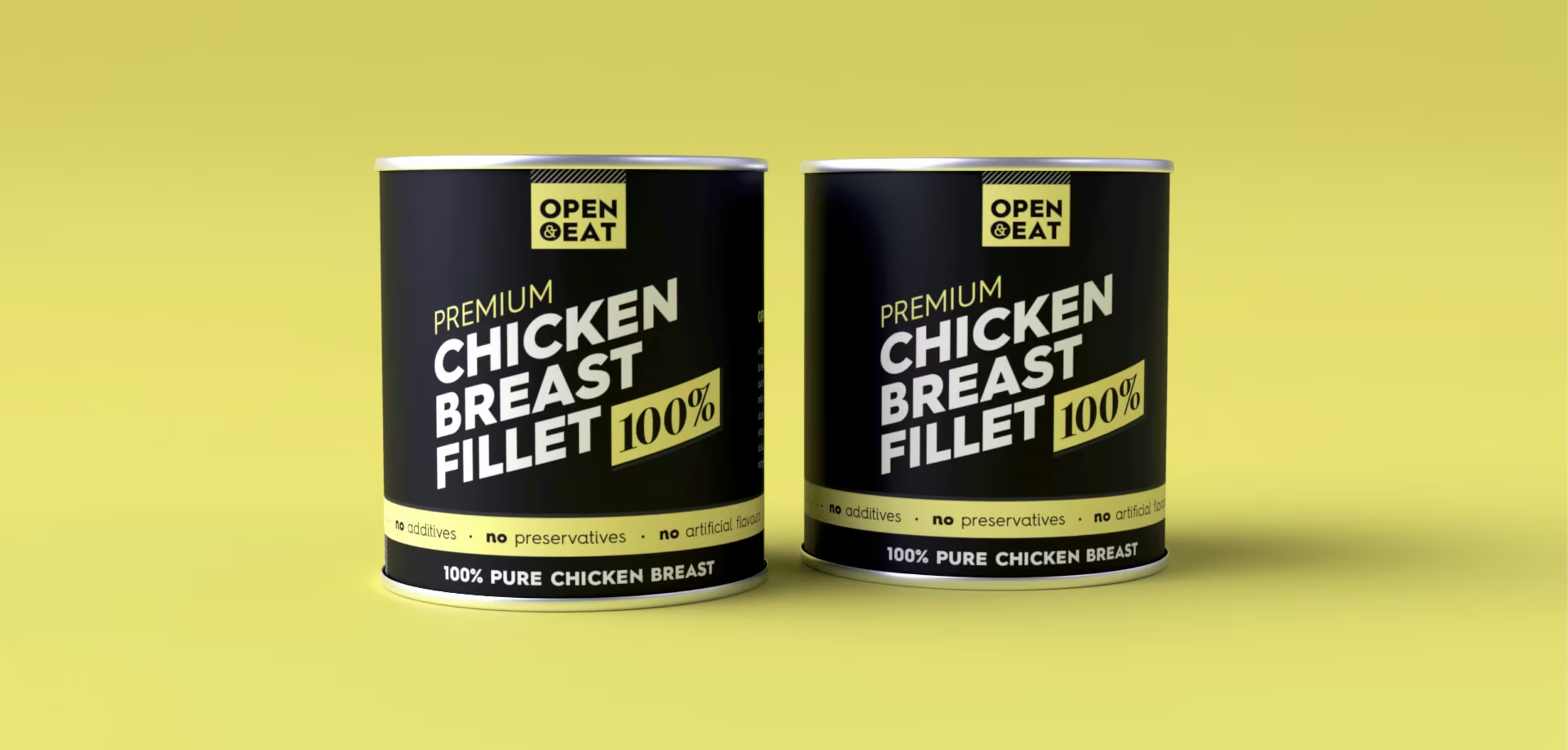
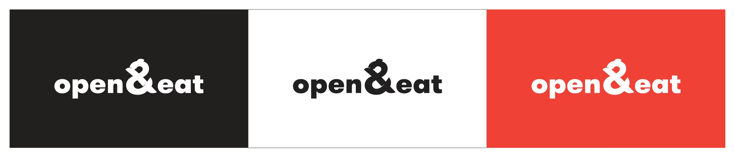
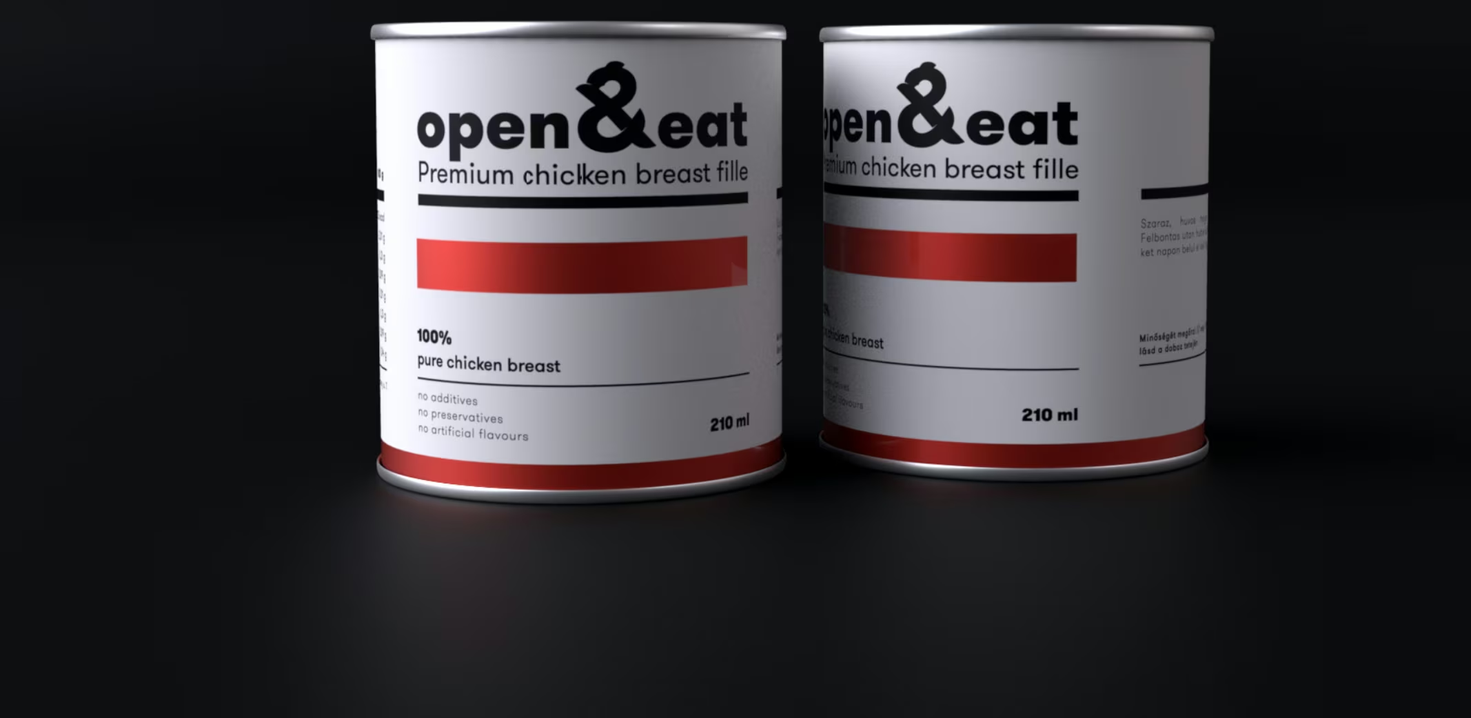
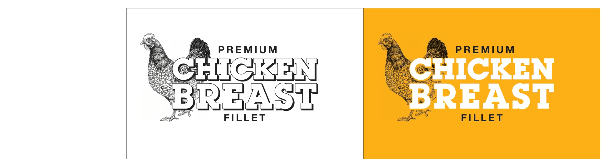
Brand identity for Open & Eat, a canned chicken breast producer: wordmark, chicken illustration, a label system across can sizes, packaging artwork and a product packshot film.
The challenge
Open & Eat makes canned chicken breast. It is a simple product in a category where every can looks alike: a photo of food, a red banner, a claim in capitals.
The brief was a brand that could hold a shelf and a product page on its own, with no restaurant, chef or origin story behind it. Just the product, said well.
The approach
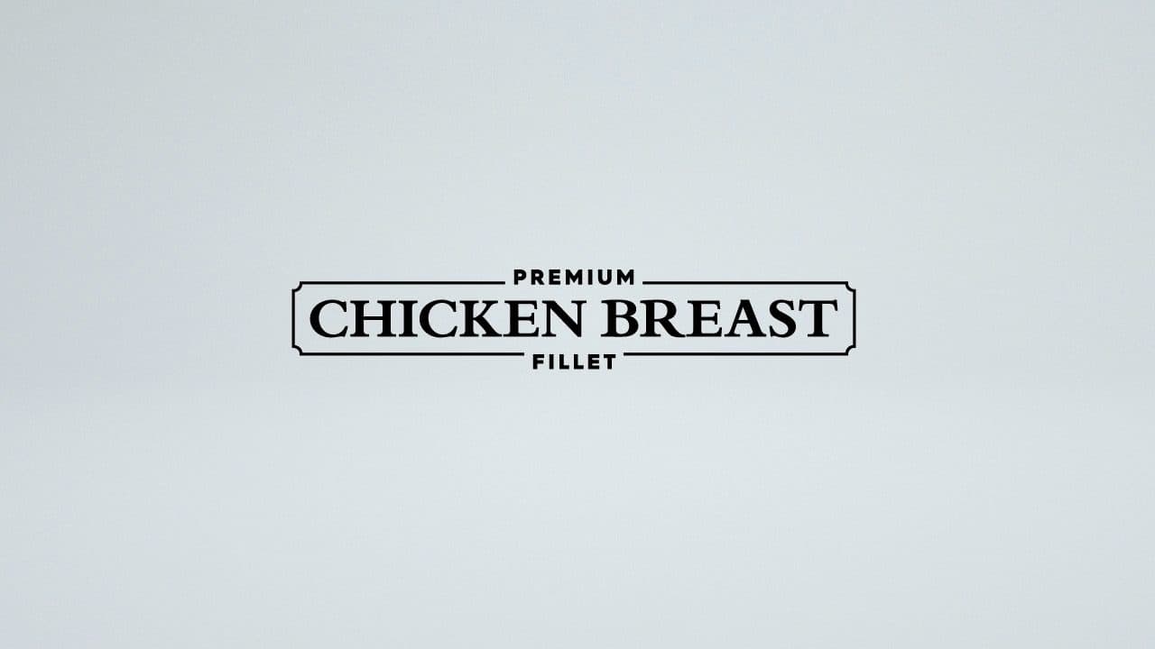
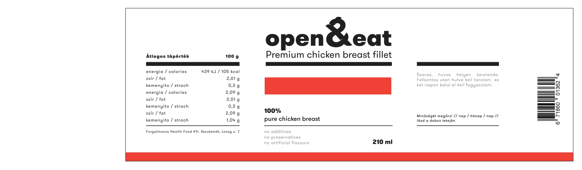
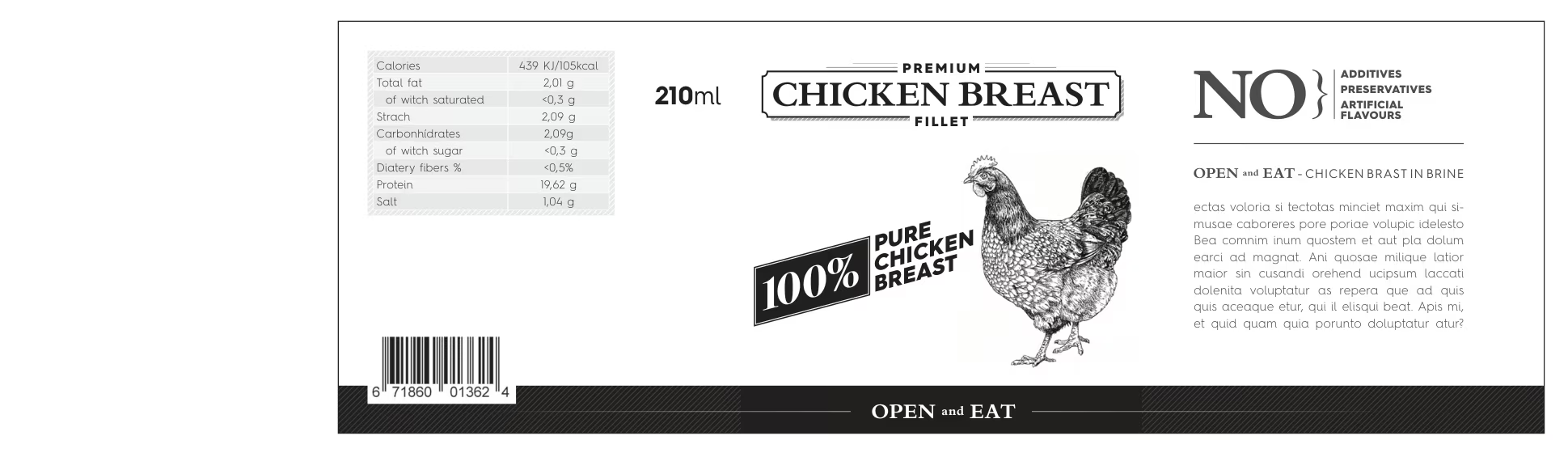
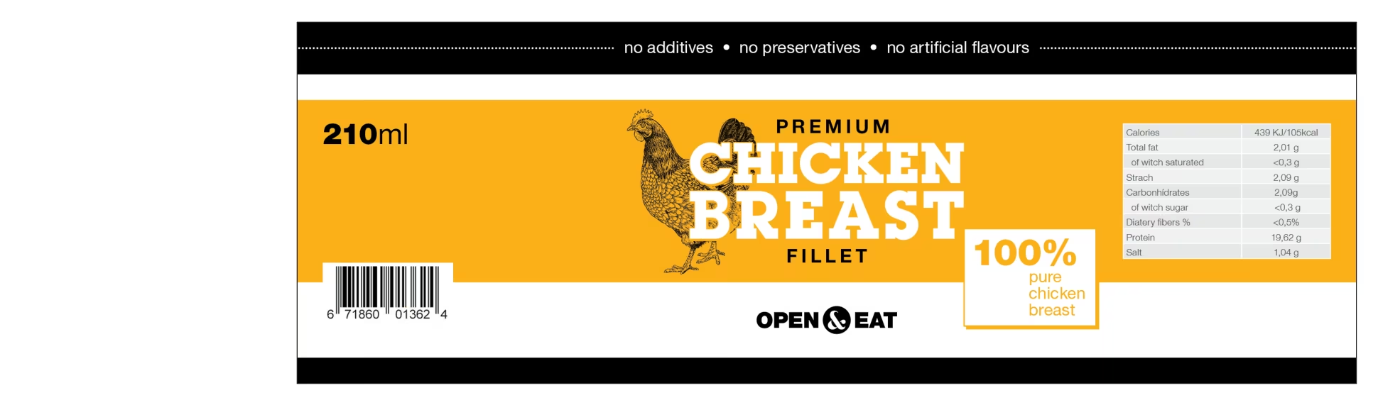
The identity is typographic. A wordmark in a framed lockup, a chicken drawn in the same line weight, and labels that put the contents first: Premium Fillet, 100% chicken breast, Open & Eat.
The label system runs across can sizes and variants in black on white, so the product reads from across an aisle. A ten-second packshot film turns the cans for the product pages and the feeds.
The work


Films
Premium Fillet packshot
What we delivered
- Wordmark and logo lockups
- Chicken line illustration
- Label system across can sizes
- Can packaging artwork
- Product packshot film, ten seconds
- Brand guidelines
Related projects
All work
We apply the same thinking to every engagement.
Book a 30-minute strategy call. We'll look at your challenge and say whether we're the team for it.